
Bitcoin weekly weighted average price, July 2010 through April 2014
/Here is an update through April 2014 of a chart I published at several different points last year. It takes several measures to enable a longer-term overview next to the more typical focus on short-term trends. Notes on the reasoning behind these measures are included after the chart.
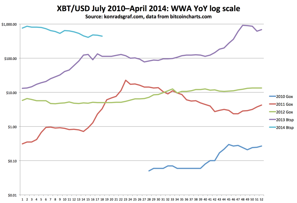
Notes: The log scale enables comparisons that reflect percentage changes across large differences in relative scale. Whereas a doubling from $1 to $2 would disappear next to a doubling from $100 to $200 on a single linear chart, this chart is able to better show both doublings at a similar relative scale of effect in its own context.
Second, weekly weighted averaging helps show price trend by general significance. This gives less weight than a daily high/low scale to headline-catching numbers that, as a practical matter, only impacted a relatively low volume during the most extreme moments of a mania peak or panic bottom, and dispite their general relative irrelevance, become the eternal darlings of all headline writers.
Third, the year-over-year comparison format shows that at least up to the present, the price has been significantly higher YoY throughout its entire history, with one famous exception, which resulted from an extreme upward and then less extreme downward price movement in 2011.
While the earliest price information begins to appear in late 2009, it is relatively sketchy and it is unclear how many trades actually took place at those published prices, so this version begins with the opening of the Mt. Gox exchange in July 2010 at $0.05. I switch to Bitstamp for the beginning of 2013 onward to factor out the impact of withdrawl irregularities that began to impact Mt. Gox data already in spring of 2013 and later worsened.
