
Tiger cub growing up? Bitcoin weekly average closing prices year over year
/ A young tiger already has some “tigerness.” Source: Sakurai Midori, Wikimedia Commons.
If the exchange value of Bitcoin is a volatile tiger cub at play, the beast has nevertheless been growing up year by year in the process. It was born sized about $0.05–$0.07 in July 2010. Now this youthful price tiger is three years old. Exchange data is available for 2011 and 2012, plus about half each of 2010 and 2013.
Short-term charts have their place. Chartists such as Rob Wilson at Bitscan brave the tough task of trying to provide parameters for those considering specific upcoming buying or selling decisions. However, a longer-term view should be assembled from vantage points that support a longer-term orientation. Moreover, understanding history ought to be done first and independently from attempting to look toward the future.
The way information appears or is remembered can create a range of impressions. The altitude from which one views the ground can change what one perceives: from ants to streets to towns to geological features to continents to small blue planets. It is useful to check in with the view from different altitudes and to consider which numbers are being used for statistical reference—and for what reason. Choice of statistics should be conscious and matched to its purpose.
Here is a chart of the all-time BTC/USD exchange rate on Mt. Gox presented differently than usual in several respects. First, it is built on weekly weighted-average exchange rates, which reflect not only moment-to-moment changes, but how much volume changed hands at which rate. Second, the dateline is not consecutive, but is for a single calendar year (2011 as calendar base). Each year has its own line with its respective weeks matched to the 2011 weeks within a couple of days. Third, a logarithmic scale is used.

This provides some impressions that may differ from those of typical narratives. First, weekly weighted averages de-emphasize outliers, particularly the dramatic features of rush-and-crash events so beloved of speculators, critics, and headline writers alike.
Second, in the much longer-term year-over-year view (comparing the lines to one another), Bitcoin’s exchange value has only risen, usually substantially, with a single large exception. This exception was due to the first great run-up of 2011, which started with Bitcoin breaking the psychological $1 “parity” barrier in April. Despite all the drama that followed, it never came close to falling through parity again—its next weekly weighted-average bottom was $2.36 in November. While 2012 appears relatively steady in this light, it was the cub’s earlier rambunctious leap and landing in 2011 that left behind this sole period of year-over-year decline, now visible as a mountain-shaped cross-over with the 2012 line.
But what about $266?!
The obligatory darling reference of just about any commentator on Bitcoin, but particularly journalists and critics, is the $266 high on April 10. But how significant is this number?
First of all, all trading at $266 was recorded within a one-minute period. That was also a minute measured on a malfunctioning exchange that had been pushed beyond its capabilities and was suffering increasingly long response and clearing delays.
Zooming out the perceptual scope step by step, trading proceeded at anywhere over $260 for 45 minutes; anywhere above $240 for six hours and anywhere over $200 for 30 hours on 9-10 April. These are actual trading prices.
The next way to widen the perceptual scope is with weighted averaging. Turning even to daily weighted-average data shows anything over $160 only for 8-11 April, a total of four days (yes, that is a 1 and not a 2 in that $160). Even the peak “266” day’s own daily weighted-average was $214. Returning to the weekly weighted average, the all-time peak weekly figure was just $138.
Here is the above chart switched to a linear scale.
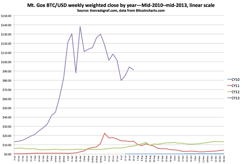
This linear view does leave a more extreme impression of 2011 and 2013 than the logarithmic view, and the penny trade of 2010, with its weekly average peak of $0.28, disappears into the baseline, but it is still considerably less extreme-looking than a chart with $266 at the top. Instead, the all-time chart of weekly weighted-average prices tops out at the relatively mundane $138.
Still, all told, that little tiger does seem to be growing up. It grows larger each year. How cute and silly when a cub ambushes a rustling leaf and tumbles off the side of a fallen tree.
Yet grown-up versions of such creatures hunt down and eat large animals. As the years go by, dismiss this still playful creature lightly at your own risk.
